Blog

High School

A Cape for Albert / King for a Day

Last October, when CVS discounted their Halloween merchandise about a week before the Day, I found some “Dress Up Skeletons” that were actually fairly accurate anatomically for $4 decorations. With 50% off, I couldn’t resist the opportunity to get something that both amused me and might come in handy in a future figure drawing class. I chose a skeleton wearing a gold crown and black cape with fur trim at the neck. It reminded me of Dave Gahan in the video for Depeche Mode’s “Enjoy the Silence.”

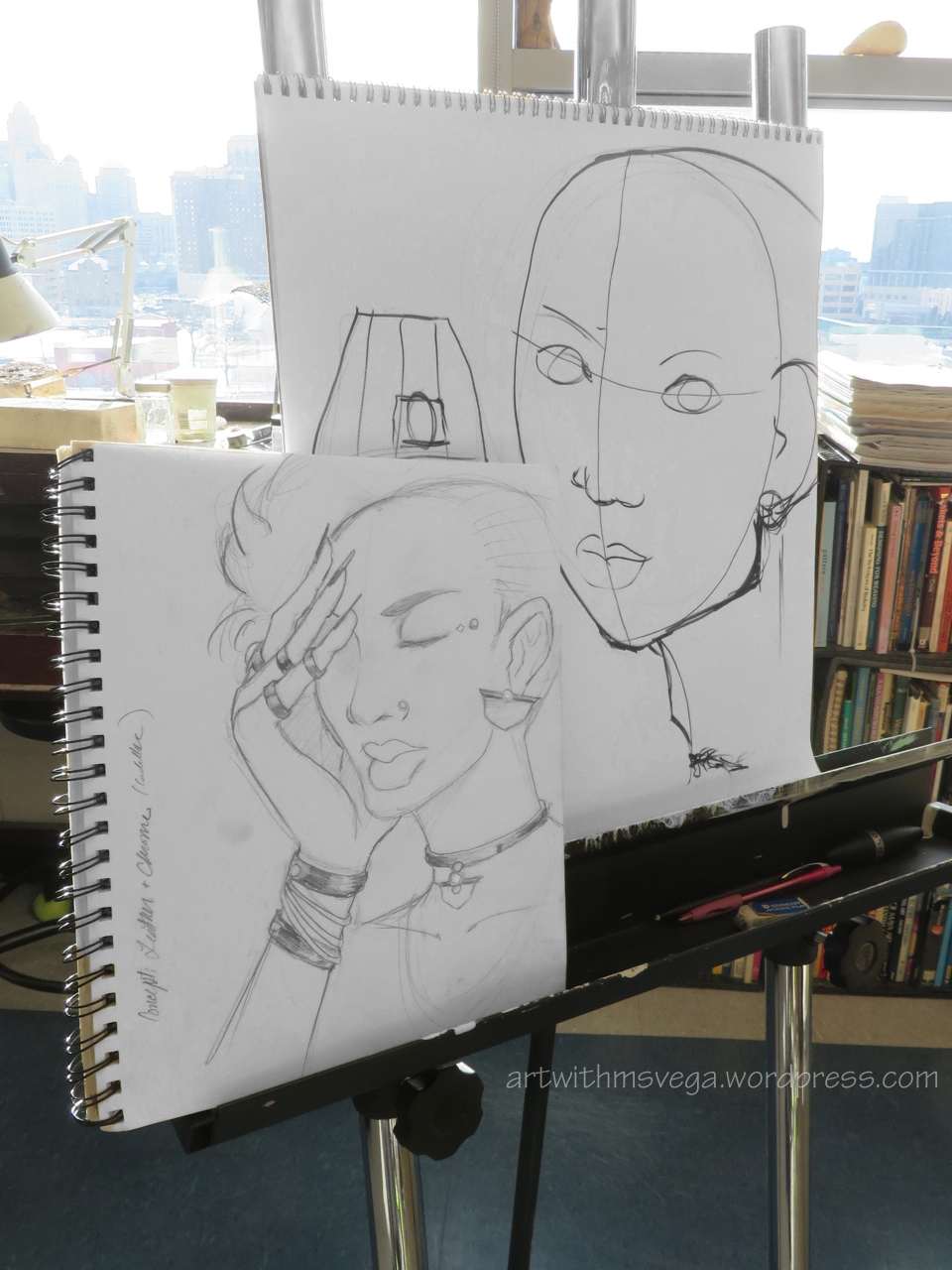
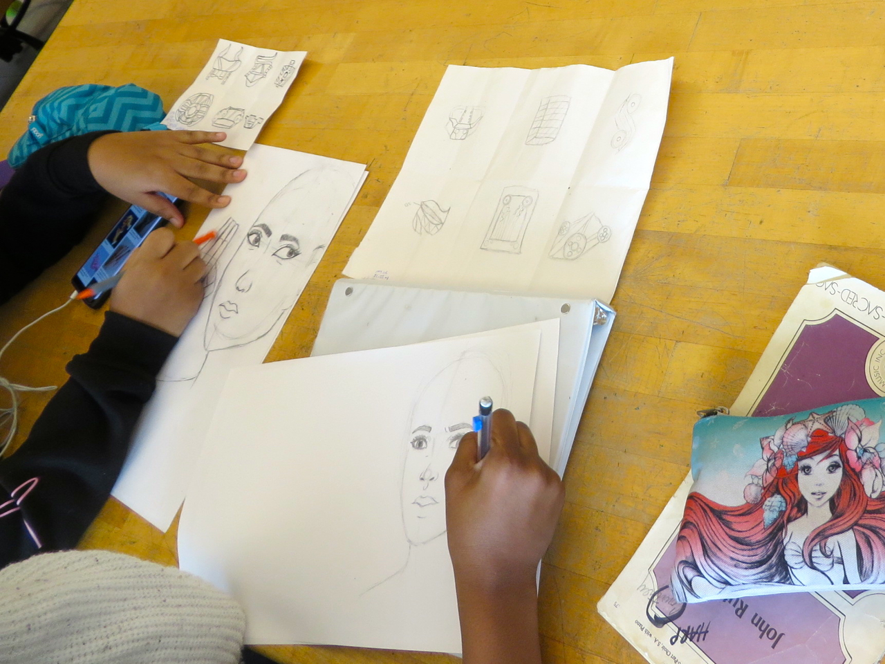
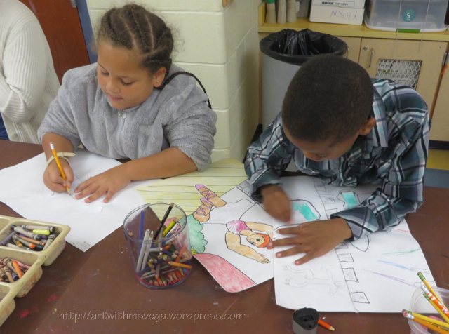
When I started my full-time student-teaching in January and saw how much help the students in the Fashion Illustration class needed with figure drawing, I got the skeleton out from my Halloween decorations box, and took it along with a miniature of the usual jointed wooden reference figure found in art supply stores. It was at school that I realized the true potential of this skeleton.

This pose was not staged

That potential was for pure comedy gold. Though I would sit it up on the windowsill or at my table, it would inevitably fall over. Sometimes people would pick it up and set it back down without trying to sit it back up. Either way, the skeleton would end up in the most hilarious poses all on its own. It didn’t help that the hinge at the jaw was so loose it wouldn’t stay closed. So the skeleton has a perpetual look of sheer joy and/or surprise on its face, as if it’s always at the peak of a roller coaster.

Because of the type of person I am, I couldn’t keep referring to the skeleton as “the skeleton.” But I didn’t want to give it a name a student or teacher had, as not everyone is comfortable with skeletons and other death symbols. Neither did I want to potentially jinx Mr. Gahan by naming the skeleton Dave, and there was already a David in the room—a replica of Antonin Mercié’s statue of the Biblical hero. Despite those constraints, with current trends away from traditional names, it wasn’t that hard to find names no one had even in a school with nearly 3,000 students. Given the skeleton’s outfit and the fact that I was watching Masterpiece’s Victoria, I soon realized that his skeleton was none other than His Serene Highness Prince Albert of Saxe-Coburg and Gotha.

Prince Albert as played by Tom Hughes on PBS Masterpiece’s Victoria

It was at this point that I perhaps got a little carried away. But I regret nothing. 😂

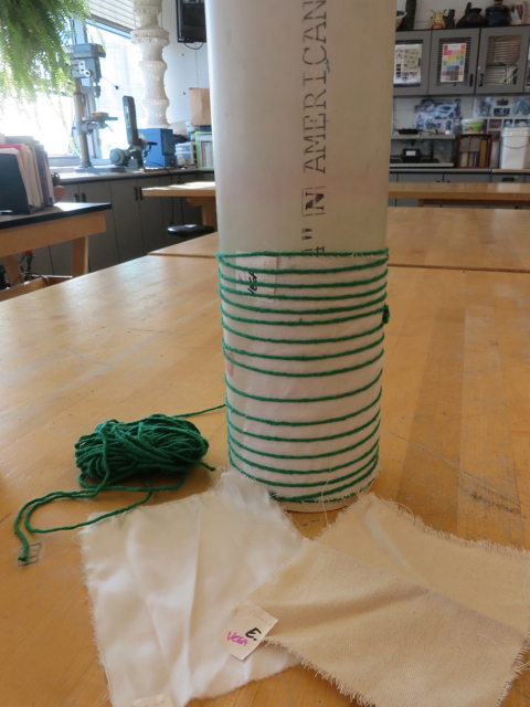
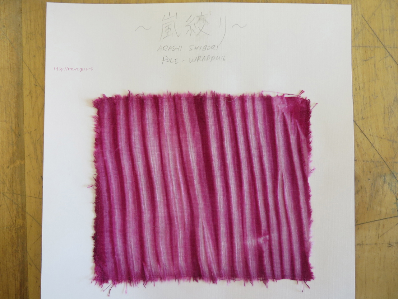
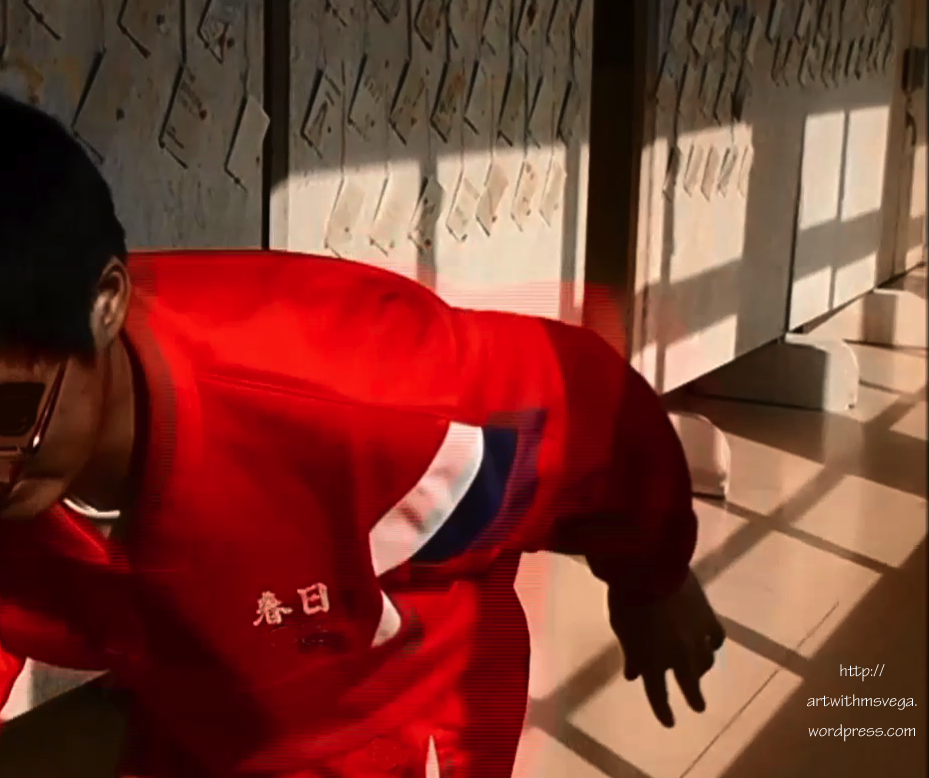
The black, plastic cape Albert (the skeleton) came with had been hot-glued onto his scapulae, but it had come off one side. Since I was going to be learning how to do shibori dyeing anyway, I decided to make Albert a new cape. I sketched out a design that incorporated stitched shibori, settled on a color (red, of course), and cut out a piece of silk. The Townhill Studio website was particularly helpful for figuring out how to do the stitching, as my first attempt at nui shibori had not come out to my liking.

Unfortunately, I had some trouble keeping my stitches straight on the slippery silk. What’s more, since I was only tying two knots into the quilting thread, on one of the chevrons, the knot actually slipped through the needle hole, undoing the resist! To add insult to injury, when I went to iron out the dyed piece, I didn’t notice that someone had left a tiny bit of fabric glue on the ironing board. The glue got on the silk, and I could not get it out for the life of me. Between this blemish and the incomplete chevron, I decided to give it another go, using rayon this time.

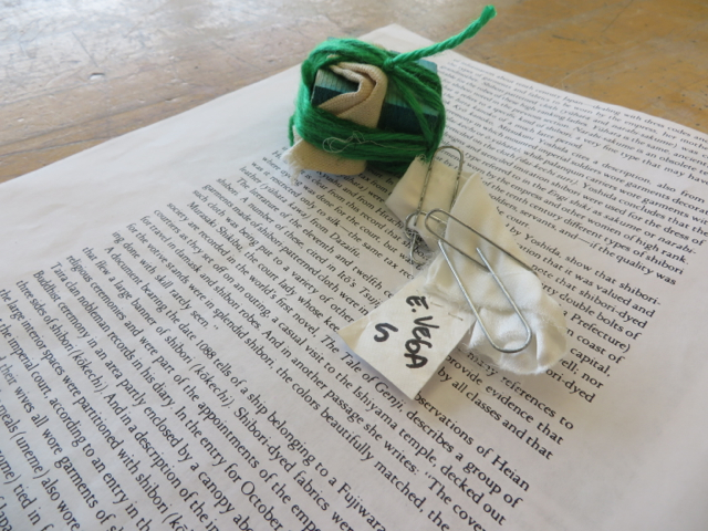
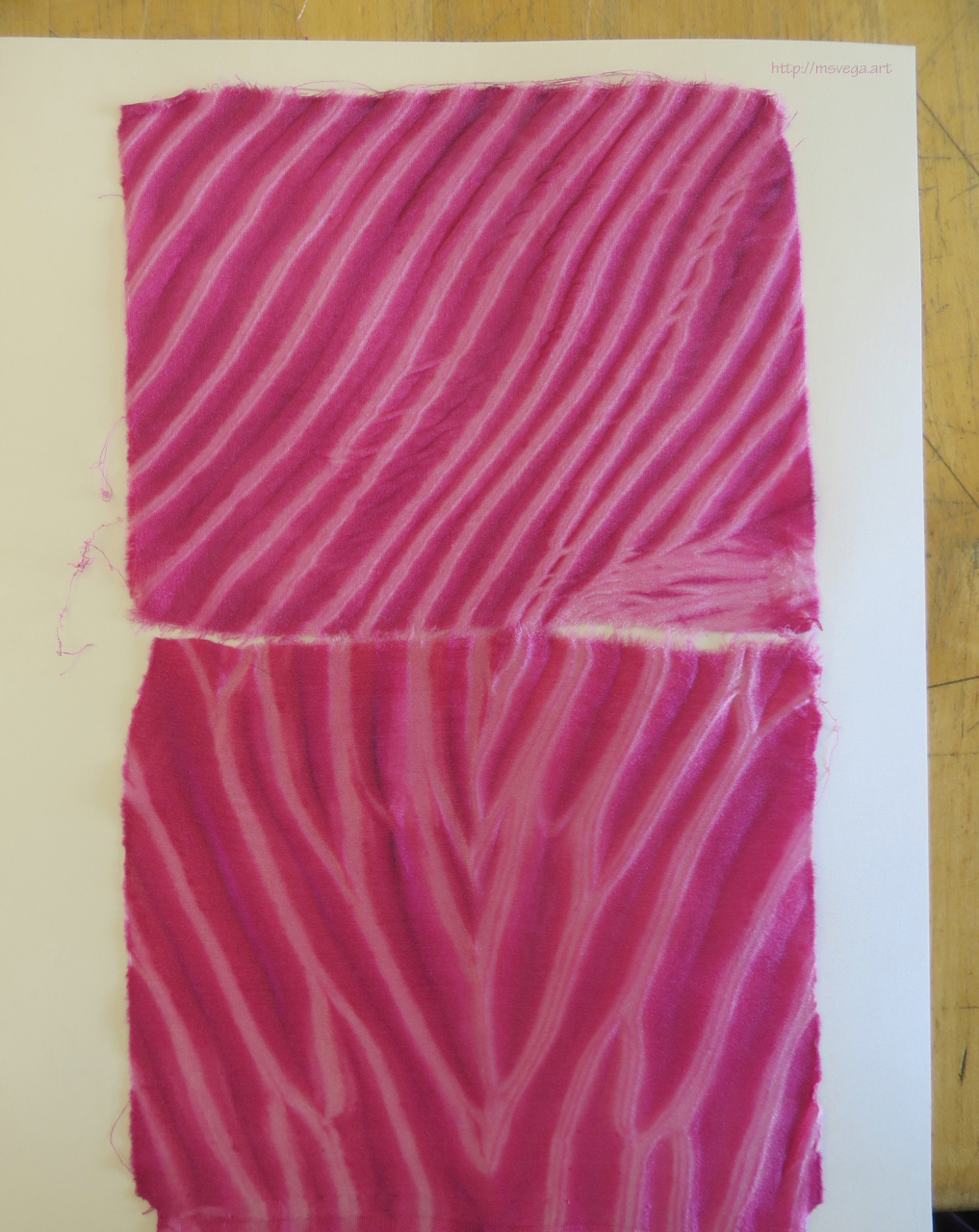
I did, however, really like how the circle had turned out on the silk piece. I achieved this effect by stitching all around the circle with a single thread, then using rubber bands to have a makiage resist to create the wide band of white.

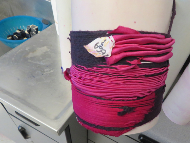
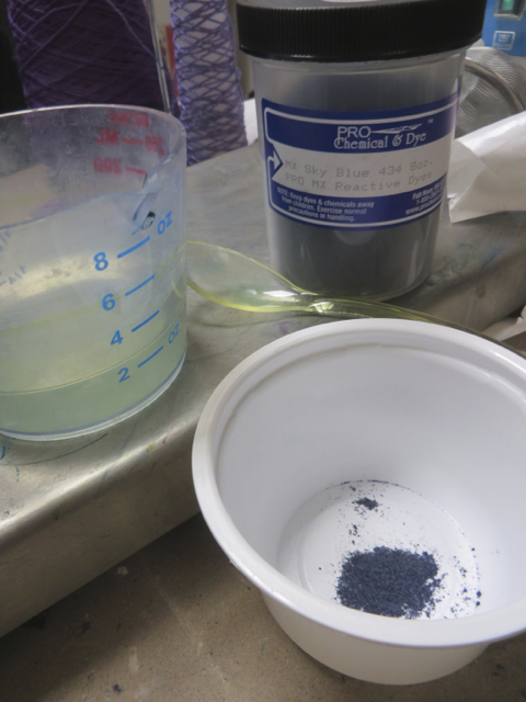
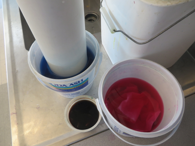
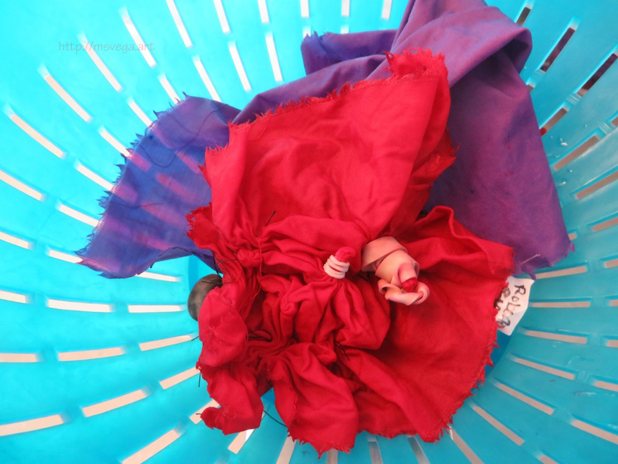
Albert being funny again, and the rayon cape getting dyed in Strongest Red.

The circle didn’t come out as nice on the rayon cape as it had on the silk one. Perhaps it was because I stitched the circle in two parts rather than one. I had thought having more sections would create a stronger resist and thus a bolder pattern, but I guess one of the semicircles ended up under the other or something. It was still an interesting effect, however.

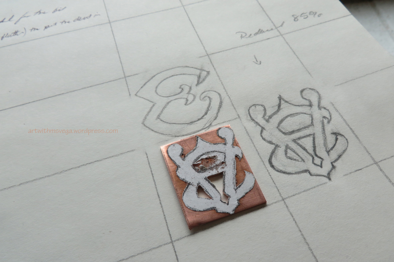
Once the cape was dyed, I set about embroidering a blackletter capital “A” onto the cape, with the stitched shibori circle serving as a “halo” for it (since one of Victoria’s pet names for Albert was “My angel”). Working with the metallic thread was very frustrating. I Googled “how to work with metallic embroidery floss” and found this blog post and realized I was using the floss incorrectly! No wonder it kept fraying.

I was pretty satisfied with how the “A” turned out, although it wasn’t my best work. To be honest, I wasn’t trying that hard, as at this point not even I knew just how far I would be taking this. I thought this would be it, the shibori and the embroidery. But then I looked at the back of the cape, at the back of the embroidery, and realized that now, I would have to add a lining to hide all knots.

My mentor had some white velvet that would be perfect for the lining. Well, I’m assuming it’s velvet; my mentor called it “devoré” but that seems to be a process rather than the fabric itself… Whatever it is, Albert seemed to approve!

“Eso si que es humillante,” my mother opined of the string attached to Albert’s head.

Of course, it wouldn’t be a royal cape without some ermine spots. It’s rather gruesome to think that each spot on a cape represents one stoat, so I felt a little guilty even just replicating the pattern even though I obviously was not using real fur. I can only hope the sheep whose wool I used had been treated well.

I used dry felting to create the ermine spots. I had seen the students in the 3D Studio Art class employ this process, but it was the first time I did it myself!
The completed lining.

I didn’t have too much of a hard time felting. It helped that I had intentionally kept my nails long to protect my fingers from any accidental stabbings! But, as I was mostly eyeballing the placement of the spots, there were some that were too big, or too far away from the rest of the group, and I had to pull them out and redo them.

Having a velvet lining naturally led to the need to have big, fuzzy fur trim. I found a nice strip of white faux fur at JoAnn’s. I also found the perfect buttons to hold the cape closed! But before I could get to those, I had to sew the cape shell and lining together. I figured it would be difficult to pull it off by hand, so I asked my mother to show me how to use the sewing machine.

After practicing on a similar piece of fabric with a spare bit of velvet, and being thoroughly confused about why there were two strings, I was able to put the cape together fairly well. The only problem was that I had been told it was okay to iron this fabric, but that seems to have made it shrink! I know that I had cut enough to have the velvet hemming the sides and bottom of the cape, but after ironing it, it was the same length as the red rayon. So, I would need to put fur trim on the bottom as well to compensate. I found a video tutorial about putting a faux fur trim on a skirt that helped me cut the fur I had for Albert’s cape.

He’s really getting a kick out of his upgraded threads!

My mother wasn’t sure her sewing machine could go through two layers of faux fur plus the rayon and velvet, and I didn’t want to risk messing anything up, so I hand-sewed the trim unto the cape. Even pinning the fur in place, it was difficult to keep everything straight. At this point I wished I had actually measured instead of eyeballing everything. Luckily, the crookedness isn’t terribly visible once the cape is on Albert, but when it’s laying flat, it’s obvious that the trim around the neck was the experiment! I should’ve practiced with the trim on the same piece of fabric I had used to practice on the sewing machine, but at this point, I was in the home stretch and just wanted to get this done. Also, I just couldn’t wait to see it all together!

I considered several options for the cape closure. I knew I wanted to use the buttons I’d found that had a sort of abbreviated version of the UK coat of arms on them, but what about the chain? I wasn’t able to find one short enough. However, I remembered I had a bracelet with little hearts on it. It’s a child bracelet. Although it still fits, it’s a hassle to try to put it on by myself, so I never wear it anymore. Rather than let it spend another year sitting in a jewelry box, why not give it to Albert?

With the cape finally finished, it was time for a photo shoot! Click the thumbnails to enjoy the majesty of Prince Albert!

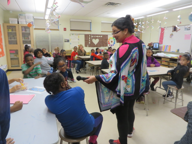
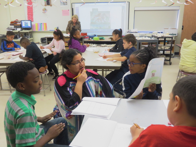
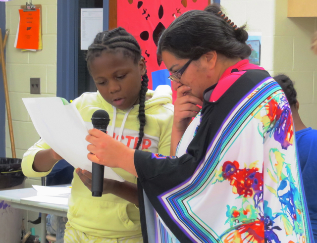
I took Albert back to school after finishing the cape so that I could show him off. I had been using him as an example in both the Fibers class and the 3D Studio Art class, which had been working on making clothes for felted dolls.

I’ll talk about this poster in an upcoming blog post.
Albert sitting with the downtown Detroit skyline in the background.

My student-teaching at Cass Tech has ended, so Albert is back home with me, relaxing in front of my jukebox. The two photos above were taken on my last official day interning there. I would joke that the little felted doll in the ceramic bowl was Victoria, but as that probably was not the intention of whatever student made her years ago, I’d like to find a shorter skeleton to turn into the Queen. Maybe I’ll find her this Halloween!

Folk Art, High School

Of Embroidery & Life Skills

I never imagined as a child that the tira de economia I was making would one day become a teaching material in a high school Fibers class.

My “tira de economia” (left) and a quilted pillow I made from a Creative Circle kit (right)
“If you didn’t have to embroider a manta cloth in school…you didn’t have a childhood!” exclaims this macro from an Honduran Facebook group

It had been common in Honduran elementary schools to teach children sewing and basic embroidery. Apparently, the practice has fallen by the wayside, if the image to the right and comments on it are any indication. Although I never got to do it in school because my family immigrated to the US before I got to the grade this was done in, my mother did take it upon herself to teach me how to make a tira de economia.

The tira de economia consists of a strip of manta cloth with rows of the various basic stitches one can use in sewing and embroidery. For example, besides the basic running stitch, there’s the buttonhole stitch (AKA blanket stitch), zigzag stitch, and chain stitch. (Chains were my favorite!) Having made one of these strips, children would then have to use the various stitches to create an image in embroidery, much like that happy strawberry there.

Fast forward to the present day. The students in Fibers class were making “quilt squares” out of fabric they had dyed with shibori techniques. My mentor teacher suggested that I show the students how to do embroidery to embellish their projects. So, I would show them my tira de economia and briefly explain what it was, and that these were the stitches I could show them how to do. I also showed them the quilting project I had done years ago, so that they could see how stitching is used in conjunction with images on fabric. For the most part, students asked me to show them how to do the running stitch and chain stitch.

Click the thumbnails in the gallery below to see some of the pieces I helped students with!

One thing that I particularly enjoyed about this project was the chance to teach students life skills they might not otherwise have picked up. To my surprise, only a few of the girls said they knew how to make basic repairs to clothes, such as mending and sewing on buttons. I saw students doing ineffective things, such as attempting to make a big knot by tying a series of single knots instead of just rolling the doubled-up thread between their fingers to make several knots simultaneously. Most students were taking the needle off their embroidery floss to tie the knot at the end to secure their work. This is much harder than using the needle itself to thread a knot. One student, somewhat to his credit, tried wrapping the thin thread around a pencil to make it easier to knot. I asked him if he was making his life difficult, showed him how to make a knot with the needle, and upon seeing how simple the solution was, he exclaimed, “JESUS CHRIST” in disbelief.

I couldn’t help but think about a video a friend had showed me about how “America should teach basic life skills like Japan does.” While my personal experience in Japan leads me to believe the video paints a very skewed picture of home ec education in Japan (it’s not nearly as gender equal as the video claims, for one), I must also admit that American students, forced to endure an environment that focuses so much on standardized testing, aren’t getting many classes that are hands-on anything. Also, perhaps in a drive to eliminate sexist practices in schools, instead of making shop and home ec classes that all students had to take regardless of gender, such classes were eliminated all together. Funding of course also comes into play. That said, some young people might complain in videos like the one made by ATTN (linked above) about not getting life skills in school, but even when students do get a chance to be in classes such as anything in the applied arts, they’re not necessarily jumping for joy at the chance to learn life skills; they might not realize that is in effect what they’re learning. They think they’re just making an image of flowers in a vase. It’s important for teachers to spell things out for students sometimes, because they might not see how something in the classroom connects to the “real world” outside of school.

High School

Fashion Illustration Class

This is an improvement for this student.

The one class I felt more comfortable taking over was Fashion Illustration. When I started my student-teaching, this class had already moved from sketching clothes to making them with fabric. However, it was painfully clear that the majority of the students needed help with drawing.

In an ideal world, only students with a deep interest in fashion and art students who had had a basic drawing class before would be in a class as specialized as Fashion Illustration. But due to scheduling issues and perhaps some other factors, there are some who had never had an art class before, others who had not had drawing classes specifically, and all but one had no particular interest in fashion as a career. As a result, even croquis done by tracing a template looked as if they had been drawn by small children in what Viktor Lowenfeld described as the “Schematic Stage,” and what I dubbed “gout people.” It’s often said that one does not need to have figure drawing skills to start designing clothes through fashion illustration, but when high school students are turning in homework croquis with models that only have hair at the sides of their head and there’s a quarter-circle in the corner representing the sun, you really have to set some minimum requirements for what’s expected in terms of technical skill.

While I can’t help them much with the actual clothes given that I only know how to hand sew, I could most certainly help them with the fashion croquis. Besides having a BFA in drawing, my first “formal” training in drawing was a “How to Draw Fashion” book that I had in elementary school. So I set about designing 10-15 minute mini lessons on drawing the figure so that students could do better on their weekly croquis homework.

Students had been given templates at the beginning of the year that used a more naturalistic 8-and-a-half heads high figure, and had been instructed to only draw women. As it wouldn’t be fair to rock the boat too much from the get-go, during my demos, I mentioned that fashion figures are usually 9 to 10 heads high but that the 8.5 heads high figure they were already using had more realistic proportions and that I would use it for my demonstrations. I started off drawing a stick figure that has its weight distributed evenly on both feet, then blocked in the body. I made one figure male and the other female, but I also spoke about androgynous figures.

In the next mini lesson I introduced “contrapposto,” which is the fancy Italian word for “The Pose People Associate With Fashion Models.” Some students who were tracing croquis templates to complete their homework worked exclusively with this pose. Those who weren’t tracing templates would often make mistakes that left their models in poses that were either physically impossible, such as having the shoulders in a steep slant while the hips remained perfectly straight despite having one leg out to the side; or very uncomfortable, such as having the knee of the high-hip leg bent while maintaining the other leg straight. Some students certainly improved in their ability to draw a stock figure without having to look at a specific template to copy after these two mini lessons.

After the basic lessons for the whole figure, I did more mini lessons on whatever were the most common issues I was seeing in the weekly croquis homework. For example, I noticed many students weren’t drawing faces at all, so I did a little lesson on that. Others struggled with hands and feet—shoes rather—so I covered that as well. I also make extensive comments and diagrams in students’ sketchbooks so that they can improve. When I took over grading their assignments, I told them that I wasn’t grading anyone based on how “well” they drew, but rather on whether or not they were applying what they were seeing in the mini lessons and in my personalized notes to them in their latest assignments. In other words, I was looking for improvement.

This student was having trouble drawing high heels from the front, making the shoes look as if they splayed outwards from the sole like a cheap knock-off in the rain…


…So, I drew a mini tutorial into her book.

Doing this kind of individual feedback is very time consuming, but it serves two purposes. For one, it customizes instruction to meet that student’s specific needs. But it also helps to make sure students are held accountable for doing their work and trying to improve. Students can’t say “I didn’t know I was supposed to do x” when they have it in writing in their sketchbooks like this. Of course, I don’t expect two or three mini lessons to solve all students’ drawing issues immediately, as drawing consistently requires lots of practice and analytical thinking during and after said practice.

Students had to get back to using their full class time for constructing their actual outfit, so I didn’t do any whole-class mini lessons for a while. In late March I talked about shading, and did a demonstration with a wooden cylinder and flashlight, as well as a drawing, so that students could create a greater sense of form in their croquis.

During class time, I only showed students shading with pencils, but during the prep period, I added a sample in color. I always leave the easel with the day’s mini lesson drawings out in a corner of the studio for students’ reference.

I don’t have many photos of student work in general, as there is always so much going on it’s hard to remember to take photos. I do regret not taking pictures of some of the better croquis, as there really were some interesting ones. Especially once we started doing themes.

The Croquis Themes Jug

At the very beginning of the school year, students had assigned themes for a few weeks, but then they were allowed to draw more freely. However, by the time I got there in mid-January, it was clear most students were merely copying poses and outfits wholesale off the internet. So, I gave each student one small piece of paper, and told them to write down one thing that they liked on it. It could be anything: a color, a material, an emotion, a fictional character, etc. They folded the papers up and put them into a protein powder jug I had rinsed out and repurposed. Each week, either I or a student pull out a paper to set the week’s theme. So far, we’ve had “Sour Patches,” “Blue,” “Video games,” and “Life.” I honestly did not know what Sour Patches were! (Ahaha!) Though I don’t have a photo of it, one student did a very funny “croquis” of a Sour Patch Kid wearing a sparkly red gown and a string of pearls. It was right after the Academy Awards, and the “Kid” was saying “I’d like to thank my manager.” It definitely didn’t have the usual feel of a fashion sketch, but then again, if Lady Gaga can wear a meat dress, why not have candy wearing fancy gowns!

~ B O N U S ~

My mentor teacher often buys magazines like Bazaar and Vogue to have as reference material for the Fashion class. I saw some interesting ad campaigns as I flipped through them. For example, Gucci has one consisting of images that directly reference famous works of art. The first one I saw was obviously a copy of Sir John Everett Millais’ Ophelia. I showed the ad to the class and asked them if they had ever seen this image before. Unfortunately, there hasn’t been an Art History class at Cass for some years now, so only one student (a transfer student) got the reference. Still, I showed the class the original painting in Gardner’s Art Through the Ages so that they could see how fashion designers take inspiration from sources across time even though they’re designing for a season that hasn’t even come yet.

Millais’ Ophelia [Source] & Gucci’s Ophelia by Monreal [Source]

Another ad that took me by surprise was for Bloomingdales. It had a pipe from Super Mario World in it. Turns out the store created some clothing in collaboration with Nintendo. This came in perfect when I pulled the “Video games” theme from the Croquis Themes Jug! A lot of students aren’t particularly interested in fashion, but many do like video games, so it helped to have such a recent example of games and fashion going hand in hand.

The collage I made for the Croquis Themes Jug consisted of images pulled mostly from art supply catalogs and whatever magazines I had in the house at the time.

High School

Shibori ~Japanese Resist Dye Techniques~

Besides Jewelry, the other class my mentor teaches is Fibers. One of her favorite dye techniques is shibori, which is, to put it simply, Japanese tie-dye. However, there are many more techniques in the arsenal of a shibori dyer than the tie-dye that was most popular in the US during the 1960s and 70s. I started practicing these techniques with the Fibers class while also reading up on them so that I would be able to introduce them to the 3D Studio Art class later. (More on that in another blog post!)

An indigo uchiwa (hand fan)

Despite having lived in Japan for four years, I didn’t know about shibori. At least, I don’t think I did. But when I saw the board about it in my mentor teacher’s classroom, I knew I had seen it before. When I was an undergrad, I went on a short study abroad program. The fan pictured to the left was a gift from my host family in Hiroshima. It’s possible they explained everything about it to me when they gave it to me and I didn’t understand; I had only been studying Japanese for two years at that point, after all.

At first, I couldn’t figure out how the pattern in this fan had been made. Now I’m pretty sure I know exactly how they did it. But it sure took a while to get to this point!

I started out by doing what the students had done at first: dye small pieces of fabric to test out the various techniques. The first one I tried out was arashi, which means “storm.” By wrapping fabric around a pole or pipe and binding it tightly with yarn, one can create straight lines that resemble rain coming down hard.

The fabric is first placed on the pole fully extended, then bound to it with yarn or string.
Once you get to the top of the fabric, you slide it down the pipe so it bunches up like this.

I also tried the techniques of folding & clamping, bean-binding, and stitched shibori. Unfortunately, I didn’t take photos of the results of all of these, and they are currently at the school. But there’s still plenty I can show while still getting this post up in a somewhat timely manner!

Folding & clamping fabric between blocks and between paper clips. The reading underneath is an excerpt from Yoshiko Wada’s book “Shibori.”


The pipe after the dye bath

I first tried out the arashi technique using one piece of rayon and two pieces of silk. The rayon piece I placed flat and straight on the pipe. I put one silk piece on at an angle, and the other one I first folded in half, then placed it on the pipe straight. Getting the silk to stay put as I bound it was a bit of a challenge, but I got by with the help of a few pieces of strategically placed painter’s tape that I removed before placing the pipe into the dye bath.

As these were just samples, neither I nor the students got to specify which color the pieces of cloth would be dyed. It was the luck of the draw that I ended up with one of my favorite colors! Getting the clothes off the pipes (once they were dry) was exciting, but the true nature of the patterns wouldn’t be revealed without a thorough ironing!

The results of my arashi experiment on rayon.

The result of the arashi technique on silk

I especially liked the pinstripes on this last sample. I wasn’t expecting them! The organic lines were also a surprise; there had been odd bulges in the silk because it was hard to keep it from moving around on the pipe, hence why the lines didn’t come out all parallel to each other as they’re supposed to with this technique. Some students said this made the fabric look like butterfly wings. I thought of a leaf.

After making several samples, it was my turn to actually make the dye bath myself. I learned how to make the dye solution for room temperature dyeing by boiling water and adding salt and soda ash to it. Before putting the piece in the dye, however, it must be placed in mildly soapy water to remove any sizing the fabric might have. Then it can go in the dye bath!

The pigment comes in powder form.
Old yogurt and soda ash containers working hard!
This color is called “Strongest Red”—for a reason!

The piece above might actually be for a certain special cape I made for a Halloween “Dress Up Skeleton.” But that’s a whole ‘nother story!

Eventually I was entrusted with dyeing the students’ pieces. I’m relieved when they ask for a color that we have in stock straight from the bottle, because I’ve been a little off when I have to try to mix dyes. It is the first time I do this, so I suppose my results aren’t too shabby, although there’s still much I need to learn about this process.

High School

Designing Jewelry with the Wearer in Mind

Last time I talked about my experience being a student in my mentor teacher’s jewelry class. At about the same time, there was one day when my mentor had to be absent, so I had to teach an almost totally unknown subject on the fly! Of course, I spoke with my mentor by phone that morning, so it wasn’t like I was totally alone. She said the students should work on their automotive-inspired designs by researching cars and car factories online. They had already spent a bit of time doing this and had submitted initial sketches. I suggested adding an element of figure drawing into it by having the students sketch people actually wearing the pieces they were coming up with. My mentor agreed, and I used the second period prep to put together a quick sample sketch.

Basic head and hand illustration to model jewelry on

At the time, this seemed like the most natural progression to me. After all, when you’re learning how to do fashion illustration, you first learn how to draw a basic human figure to put clothes on; you don’t start out with flat, technical drawings even though these would perhaps highlight the specific qualities (in terms of cut, color, and pattern) of the garment itself more than drawing it on a fashion figure.

So I told the students to start thinking about turning their automotive sketches into jewelry. At that point, most still had concepts that looked very obviously like car parts. How can we take the shapes we see on cars and turn them into jewelry? How would these pieces look actually being worn?

I sketched out one example, taking the Cadillac shield as inspiration. It would perhaps look tacky to use an actual Cadillac logo as earrings, but by taking the shape only, we can allude to the classic car aesthetic without simply copying it. I later colored the gems red to further the reference to cars, tail lights in particular.

Now, as many students in the two jewelry classes are taking the class as their art elective, they don’t necessarily have figure drawing skills (but some do). So I did a demo on how to draw a very basic head, face, and hand so everyone could at least get started. With this particular pose, they could have a model for nearly all the kinds of jewelry they could make in this class. I instructed them to put at least three pieces of jewelry on their model.

Students looked at the sketches they had done in a previous class to figure out how those pieces would look when actually being worn. These two students enjoyed putting lots of detail into their faces, not choosing to use the “cheat” of having the models’ eyes closed!


Some students were having a hard time making the conversion from “car parts” to “jewelry,” so I encouraged them to make up a personality for their model. This student even named his model, and got so into it, he came in on his lunch hour to further tweak the image!


What does this person like to do? What kind of clothes would they wear? If they were in a store looking to buy a new accessory, what would catch their eye?

Click the thumbnails below to see more examples of student work

Several days later, I asked my mentor teacher if it was more common to design jewelry by drawing only the jewelry, or by rendering as it would actually be worn. To my surprise she said jewelers always sketch the piece alone. They had to consider size and the balance of the piece itself (for example, how a brooch will hang on a garment), but otherwise, they didn’t think of it necessarily in context of the shapes of the human form it would eventually adorn. On the one hand I thought such an object-centered approach was a bit lacking in humanity. But on the other, it’s not as if the pieces that have been made this way don’t look good on people. Either way, I don’t think it would hurt to sometimes design jewelry while thinking of how it will harmonize with the lines of the person who will one day wear it. I’m sure this approach might generate ideas that might not otherwise occur to someone!

~ BONUS ~

My favorite jeweler is silversmith Jigoro ARAKAWA, who makes jewelry under the brand name Gigor. I had seen this video long before I would be using some of the tools in it myself, but it was nice to come back to it and be able to say, “I know what he’s using that for now!”

High School

The Jeweler’s Apprentice

I’ve begun my full-time student teaching at none other than Cass Technical High School, my alma mater. At first I thought I would be in the Art Composition classroom, meaning I would be working mostly with freshmen in 2D. But I ended up with the lead art teacher, who teaches Fashion, Jewelry, Textiles, and Studio Art 3D, primarily to the upperclassmen. I have zero training in Jewelry and Textiles, and only informal “training” in Fashion (think “How to Draw” book for little kids that I went through in elementary school). So I was a bit concerned about how this placement would go.

Luckily, my mentor teacher was all for having me be more “student” than “student-teacher” in the Jewelry and Textiles classes. I’ll introduce my first experiences with textiles in a later post. Here, I’ll talk about my first-ever jewelry piece.

The first assignment students had was to create a monogram in copper. They had The Encyclopedia of Monograms compiled by Leonard G. Lee to use as reference. I looked through the options for all possible combinations of my initials, but the ones I liked were quite ornate and I worried I might not be able to cut them out in metal very well. Ultimately, I borrowed elements from other monograms to create my own “EV” with a hint of an “A”—a design that would be appropriate for my first attempt at small-scale metalwork.

We photocopied my sketch, reducing it to 85%. I then cut out the copy and glued it unto a piece of copper that was cut down with metal shears to be just big enough for the design. Waste not, want not!

After my mentor showed me how to use a punch to mark where to drill to create the negative spaces, a student showed me how to use the drill press. I’ve used one for woodworking before so this part at least felt a bit familiar. Another student showed me how to place the blade into the jeweler’s saw and how to cut the metal. All was going well until I had to turn a corner. I looked in The Complete Metalsmith by Tim McCreight but didn’t find an answer. My ungraceful workaround was to simply make multiple cuts within the space. One broken saw blade later, I got a demo from my mentor, and described the proper technique thus in my sketchbook:

TURNING THE BLADE W/IN A SPACE: This was the hardest thing to intuit. When working w/ wood, I’ve just drilled 2 holes w/in the space. But there is a way to turn the blade instead. Similar to “filing w/ the saw,” the main thing is to stay in the channel, turning the piece veeeeery slowly so as to slowly widen the channel. In a way, it’s not really a turn at all. It’s more like a せんす opening.

The piece fully cut, but before sanding.

A せんす (sensu) is a folding fan. Once I had this image in mind, I was able to cut out all the remaining negative spaces. I broke two more saw blades getting everything cut, but that’s not too bad for an amateur, is it? (Ahaha)

The next step was filing and sanding. This was also something I was quite familiar with through woodwork. I had sanded some of my pieces down until they were soft enough to want to rest your face on! I had also restored my car’s headlight lenses relatively recently, so I knew that, counterintuitive thought it seemed, the way to get something nice and shiny was to first scratch it up.

As I sanded the piece, I noticed that it looked better upside-down. While I prefer to go as “EV” if I’m only using one last name, the piece looked far more dynamic when flipped and turned, making it read more as “EA.” This orientation also had the added benefit of putting a small opening near the top—a prime spot for a jump ring.

I used a “Twirl-a-Ring” tool to make jump rings out of 18 gauge wire.

I haven’t done any soldering yet, so one of the more advanced students soldered the jump ring shut for me. It made me think about all the times I had used pliers to close a jump ring that had opened up on a phone strap, key chain, or other such accessory. How nice to know that wouldn’t be a problem with this piece!

I added one last feature to this piece by curving it by hand against the horn of an anvil. I hadn’t wanted to add texture, so this gave dimension to an otherwise flat piece.

Once that was done, I learned how to polish it on the buffing machine. But doing so revealed some deep scratches I hadn’t seen before. I went back to a medium grit sandpaper to get them out, then back up to fine, then went back to the machine but…I couldn’t get an even polish, and in any case, I had once again revealed other surface imperfections, albeit small ones. My mentor suggested I use steel wool to create a satin finish. I did so, and am mostly satisfied with the result. Some spots always look strange, but I think it might be the oil from my fingers. In any case, I think it isn’t bad for my first attempt at metal jewelry-making, and it probably makes the students feel more confident to know that they were the ones teaching the teacher!

Now I just need a nice chain : )
High School

Flashback: Mythology Mini Books

In March of 2013, back when I was teaching English in Japan on the JET Program, I did a unit with my tenth graders on mythology. It started off with reading summarized versions of the myths “Orion and the Scorpion” and “Echo the Nymph” in class. The next phase consisted of students looking up a story from any world mythology online or in the library for homework, then writing their own summaries in English and presenting these as speeches to the class. Students also had the option of writing their own original stories “inspired by the night sky,” which was a phrase used in their English textbook Prominence to describe how many myths came to be. The grand finale—and my favorite part—was turning these myth summaries into mini books.

Samples I made to show students their options and the level of finish I was expecting

The “book” was made from one sheet of A3 paper (approximately 12 x 17 inches). I had learned how to fold a single sheet of paper into an 8-page mini book from another ALT (Assistant Language Teacher) who had presented the technique in a meeting. Instructions can also be found on various websites. I like the explanation given by the Fiji Island Mermaid Press. Once folded, the pages end up being about 4 x 6 inches when you use A3 size paper.

Unfortunately, right around this time my camera was malfunctioning (note the horizontal lines visible in the above photo at full size), and by the time students completed the assignment, it had stopped working altogether. I did not get around to buying another one before returning students’ projects, so I don’t have good quality photos of them, which is a real shame. All I have is what I took with my laptop’s camera. Still, the students who put a lot of effort into their books did so well that it comes through even in these images. Click the thumbnails for the full size!

“Arachne changed into the Spider” by 1-5-37 N.Y.

“Arion’s Story” by 10-1-27 M.K.

“Odysseus’s Voyage” by 1-2-26 N.K.

“Ikaros’s Wings” by 1-3-24 K.H.

“Gemini – The Story of Good Twins” by 1-3-40 S.Y.

Side note: Many students translate directly from Japanese when stating what grade they’re in in English. This is a problem because the count starts back at one with each level of schooling in Japan, unlike in the US, where it’s continuous from 1st through 12th grade. So “High school year 1” in Japan is equivalent to 10th grade in the US.

“Daphne” by 1-8-32 H.R.

“Thor became bride” by 1-5-40 W.M.

Though the majority of projects did end up being based on Greek mythology, there were also some books on Norse and Japanese mythology, one on a Bible story, and a few original stories.

This was a massive project at the end, because I wanted to display the students’ books in such a way that others would be able to read them—without walking off with them!

I chose about 50 of the best books (out of 400) to display on freestanding boards outside the Language Lab. I taped a length of colored raffia to each book in the central fold so that it  stuck out at the bottom like a bound bookmark, and at the top to give me something to hang it from. Each book sat in a “cradle” of two push pins. This way, passersby could read a book and easily put it back in place when they were through.

The boards are visible behind the student in this otherwise unrelated image

By the time I got this display done, my camera’s shutter was stuck in the completely open position, so I couldn’t capture anything other than a blaze of light. Luckily, the board showed up in this scene from one senior homeroom’s movie presentation for the school festival, so you can at least get some sense of it.

I have included here PDFs of the in-class handouts and lesson plan I made for this project, as well as the sheet explaining the homework assignment. This was definitely my most successful injection of the visual arts into the English curriculum!

Upper Elementary

Graffiti Style Name “Throwies”

The last lesson I designed at Lincoln Elementary was meant to engage the fourth and fifth graders on a personal level with pieces featuring their name or nickname as graffiti-style name “throwies.” When they came into the room, they noticed photos of real graffiti artworks from Detroit posted around the room and at their tables. We started off with a Visual Thinking Strategies session using these examples. I asked questions such as “What do you see?” and “What do you notice about the letters in these images?” Soon enough a student said the pictures were of graffiti, so we moved on to a brief discussion of the differences, visual and legal, of different types of graffiti.

“What did you think of the graffiti you saw in your neighborhood?”

I have done murals before but I have never done graffiti, so I thought it was important for students to hear from a real graffiti artist.

Everything begins with a sketch in your mind.
–Sintex

I had noticed that all too often students would work on something and become dissatisfied with it, wanting to start all over. But without being able to pinpoint why they didn’t like it, starting over—on top of being a waste of time and materials—hardly ever made them more satisfied with their artwork anyway. Noticing their creation process, I realized that they always tried to make the final product from the beginning on the first try. So one of my goals for this lesson was to impress upon students the importance of drawing to generate ideas, NOT to make a final product from the beginning. I showed students in-progress copies of my name design: thumbnail sketches, rough sketch, clean inked copy, and final color version, to show them that art doesn’t just magically happen on the first try.


Click the thumbnails above to see the images at full size.

On the first day, most students were able to sketch a few ideas (they had been told to do eight thumbnail sketches) in the remaining class time.

“What if you…?”


Picking the best thumbnail sketch

Some students really struggled with the concept of sketching, which threw me a little off guard. Two were so hesitant to try making any mark in their sketchbooks that they were visibly upset. They said they had no idea what to do. I said to just write their name and then change the shape of the letters to start with.

Me: Just ask yourself, “Does this look cool or stupid?” If it’s cool you keep it. If it’s not you erase it. You see how my sketchbook is so dirty? That’s because I erased a million times to come up with these ideas. When you die in a video game, do you stop playing?

Struggling Students: *Scoff* No.

Me: Well then. Don’t give up on this either!

The second day of this lesson began with me giving a demonstration of color blending with color pencils. Some students weren’t able to completely finish their designs with fully blended colors, but I didn’t think they would in just two sessions anyway, considering it had taken me about 5 hours to make my example between sketching, drawing, inking, and coloring. Still, many students were able to reach a decent level of finish on this project.

ADB was one of the students who struggled to get going, but he was able to come up with a classic joined bubble letter design in the end.


“FayFay” also struggled on Day 1; but her perseverance paid off.


Nate had been very active in the discussion about graffiti; perhaps he was already a big fan of the style?


The stands weren’t finished, but this was a great start for “bd.”


A student with autism made this dynamic piece all on his own.

Students were given the rubric on Day 1 so that they would know exactly what the expectations were. Unfortunately, some did not get around to answering the reflective questions on the rubric. In the photo below, I used a completely blank rubric to grade this student as he had not had time to fill one out for himself.

A three is equivalent to a “B” in the traditional letter grade system.


The best designs were put outside on a “wall” (a free-standing bulletin board).

To protect students’ identities, last names have been digitally removed from pieces that included them.

As someone who wasn’t terribly familiar with graffiti beyond just seeing it around town, I had to do a lot of research to put this lesson together. The examples of real graffiti that I printed out to show students were largely taken from posts about graffiti on the blog Bikes, Books, & A Little Music, such as this one. I got the “RapScript” font for the rubric on Graffiti Fonts. And of course, I looked at the home pages of graffiti artists like Sintex, Shades, and Malt. It was really interesting for me personally to delve into this genre as pretty much all of the graffiti I’d grown up seeing was gang related. Most of their tagging had no redeeming artistic quality but every now and then there would be one that did and I’d feel a bit conflicted about liking the lettering. But even the aesthetically better examples I had seen were nothing compared to the graffiti murals being done legally these days. I hope the genre can continue to flourish on welcoming walls!

Upper Elementary

Complementary Colors with Paint Swatches

My mentor teacher had a small fortune in paint swatches and I figured they would be a good way to teach students about one of the most basic color harmonies: complementary colors. The swatches also offered an opportunity to talk about other fields that connect to the arts, such as fashion, graphic, and interior design. In every 3rd grade homeroom I did this lesson with, there were several students who had seen these swatches at various home improvements stores, and one student in particular recounted how she and her sister have fun scanning all the swatches to see how much the paints cost.

The options were to create either a picture or a pattern with complementary colors. Some students drew on their paint swatches to add details, too.

The first time I did this lesson, I gave the students stencils with various themes: traffic signs, zoo animals, vegetables, weather, etc. Though I warned them that using the smaller designs on these stencils would be too time-consuming as they had to fill their 9 x 12 background with a full composition, many students were attracted to these detailed designs, which they also had trouble cutting out. Very few students took me up on my suggestion to make symmetrical shapes by folding the swatches, similar to what we had done for papel picado, or by simply free-hand drawing the desired shapes on the back of the swatch. Reflecting on this challenge, I prepared tracers of simpler shapes at a larger size for students to use—if they so desired. They were of course still free to generate shapes by any other method they desired and/or could come up with.

A piece that explores changing the scale of the same set of shapes—with a cute little winking person sending positive vibes out into the world!


This student made use of the white lines on the swatches to enhance the movement of the arrows.


This student included all 3 primary-secondary complementary color pairs, and used the back of the swatch to add texture to the roof of the house in this whimsical night scene.


I was a bit surprised by how popular the “Traffic Signs” stencils were.


Future Warhol or Lichtenstein


Why stop at the paint swatches? This student cut designs into the background paper as well.

Besides the shaped format, this student’s work is interesting for the deliberate use of glue stains against the black paper. Perhaps both the first cut in the construction paper and the first stain were accidental, but this student discovered how to make them work with him rather than against him!

That said, the neatness of the piece (cutting and gluing) were part of the assessment for this project. I did a demonstration at the beginning of the second day of this lesson on how to glue neatly by leaving space between the edge of the shape being glued and the line of glue that gets put onto it. Just as important was the demonstration on how to clean up the glue without leaving stains when it does seep out anyway. Because even the best of us will get glue in the wrong place sometimes!

A simple rubric attached to the back of students’ work gave them feedback and their grade. (A “4” is equivalent to an “A.”) This was the feedback I gave to the student who made the moon-pattern piece at the beginning of this post.

Below are some examples I made to show the students. I was also using the “Leprechaun” piece shown earlier in this post as an example for the homerooms that did this lesson after the first one, in which that piece was made. Students tend to be more invested in their own projects when they see examples done by their peers.

“Sunrise on a Foggy Day”


This quatrefoil pattern is on everything from notebooks to towels right now. Broken down into its component shapes, it’s not as complicated as one would think.


November is still pumpkin season as far as I’m concerned!

Lastly, here are PDFs of the proper lesson plan and the slideshow I used to introduce this lesson. Due to scheduling issues, the first time I taught this (and the session for which the plan was written), I only had one day to work with students on this, but the other homerooms got two days, which is far more appropriate for the amount of work required.

Once all homerooms had made their complementary color designs, we let the students take home the remaining paint swatches. There were about five boxes of them left, but the kids cleaned us out! You would have thought it was Halloween candy they were stuffing into their backpacks. Some students said they were drawing on them, others said they were going to make something out of them. One glued several around a plastic plate to make a huge flower. I forgot to take a picture of it with everything else that has to be done in an art studio so you’ll just have to take my word for it. ^o^

Lower Elementary

Action Drawings

As children transition from the preschematic stage to the schematic stage, they begin drawing people as heads with torsos and jointed limbs rather than as circles and sticks. Even after the child’s brain is ready to understand representing humans in a more realistic way, they might not know how to show anything other than a person standing still while looking forward. This lesson, adapted from Nancy Beal’s book The Art of Teaching Art to Children, helps students explore a variety of poses kinesthetically.

A second grader draws a successful free throw (work in progress)

Students first brainstormed three activities that they liked to do. Many answered basketball, football, and playing outside. They listed three activities on the back of their paper, then picked one to draw. Once that was done, they took 11 small strips of paper and arranged them on a 12 x 18 sheet into a pose showing the activity of their choice. The strips were then glued down and outlined, with details such as hands, feet, facial features, clothing, and backgrounds drawn in with pencil.

Demonstrating on the white board
The Demo Person was made out of paint swatches mounted on magnets so that I could demonstrate arranging the strips into different poses to the whole class easily.
Deeply contemplating a touchdown scene
Third graders hard at work on their action scenes. The students gluing down strips had been absent on the first day and were catching up with their peers, who were coloring on Day 2.
The student on the left is using one of the examples I had made as reference to draw her own ballerina.

While I think it would be ideal if students always tried to come up with ideas on their own rather than making duplicates of an example, I believe it’s also important to give students the choice to copy an image if they want to. Drawing especially can test people’s confidence, but allowing them to copy an example when trying something new can help them become comfortable enough with the general concepts to take a leap of faith and draw freely later on.

A student asked what figure skating looked like so I demonstrated. I wore clothing to mimic the composition of the Paper Strip Person so that students could see the parts of the limbs more easily as I moved about and did poses as requested.

Working on a soccer scene
At the end of Day 1
The scene completed on Day 2
Some students painted their scenes with tempera paint. While this second grader did not fully grasp the use of the paper strips, she nonetheless created a fascinating piece.
The most dynamic examples from the second graders’ work were put on display in the showcase in the Upper Elementary Common Area.

Wow, I can’t even draw like that now
—A fifth grader admiring the work in the showcase

A Michael Jordan fan enjoying a hoverboard ride in front of his house. Wooo!

Below is the other example (besides the ballerina) that I made to show students this type of drawing at different stages.

Walking the Dog

Besides helping students learn how to draw people in different poses, this lesson helped them spread out on the page–something small children often have trouble doing. The paper strips technique made for many fun, BOLD drawings!